


Liberty’s beautiful and iconic prints are a fundamental element of Coco & Wolf’s DNA and whilst they work wonderfully on their own, having the confidence to pair them is brilliantly bold and not as tricky as is often anticipated. It may feel like unchartered territory for most of us, but there’s a reason some of the most triumphant interiors schemes are a confident mix of colour and pattern. Today we’re sharing our top tips for successfully pairing prints to inspire either a room refresh or totally new scheme.
Consult The Colour Wheel
Loved by artists and interior designers alike, the colour wheel is an age old concept for working out which colours complement one another. In theory, colours opposite each other on the wheel will work together in a contrasting scheme, so if you really don't know where to begin, a colour wheel is a great place. Most of us will have an idea of colours we love, or are naturally drawn to, so start there when consulting the wheel. It's likely that if you love a colour, you'll love lots of Liberty fabric prints in that shade too! And it's important to remember that our home should be a place where we create what we love, you don't need to be lured in by trends and colours of the year, no matter what Instagram says. If you're not feeling quite brave enough to completely clash colours and prints, look at the shades placed next to one another on the colour wheel and pop them together. This can create a calm yet beautiful vibe. I personally love yellow and all yellow Liberty fabrics so if I was looking at base colours for prints to work alongside it using the colour wheel method I'd be looking at violets for contrasting schemes and oranges for tonal schemes.

Be Eclectic & Fun
Prints are eye grabbing and demand attention in a room, and when layered up they feel eclectic and fun. You will find that there will be a handful of Liberty fabrics you LOVE. I'm not talking about the ones you like but happily pass by, but the ones you swoon over every time you see them. That natural love of a print means it definitely deserves a place in your home, and by relaxing, and layering up the prints which make your heart sing, you'll pair prints in a natural way which reflects your own taste. So, if you're feeling confident in your own taste, ditch the colour wheel and just go for it!
Contrasting Sizes
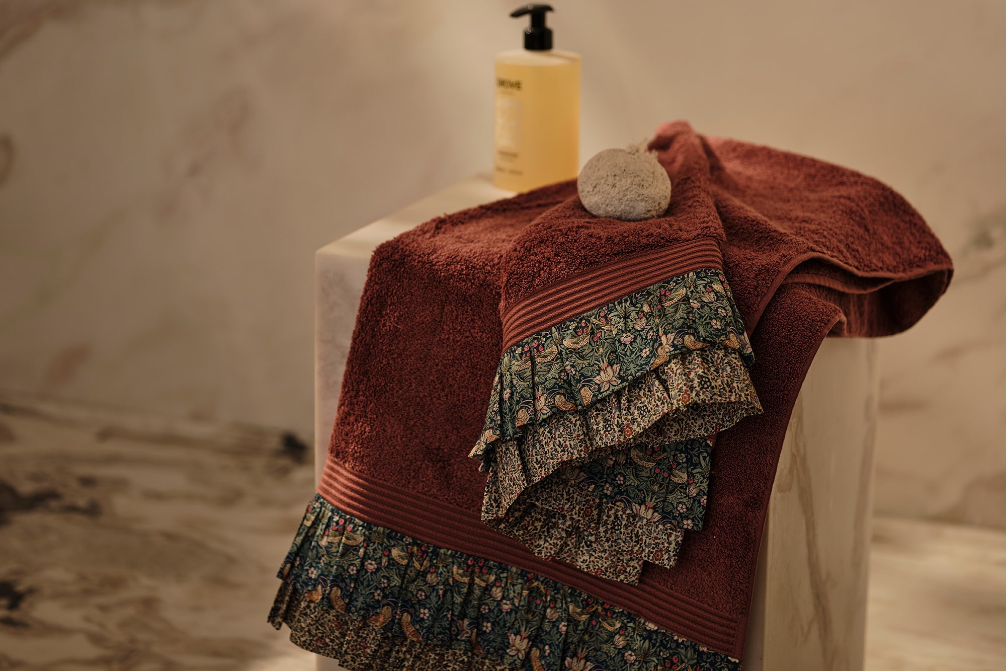
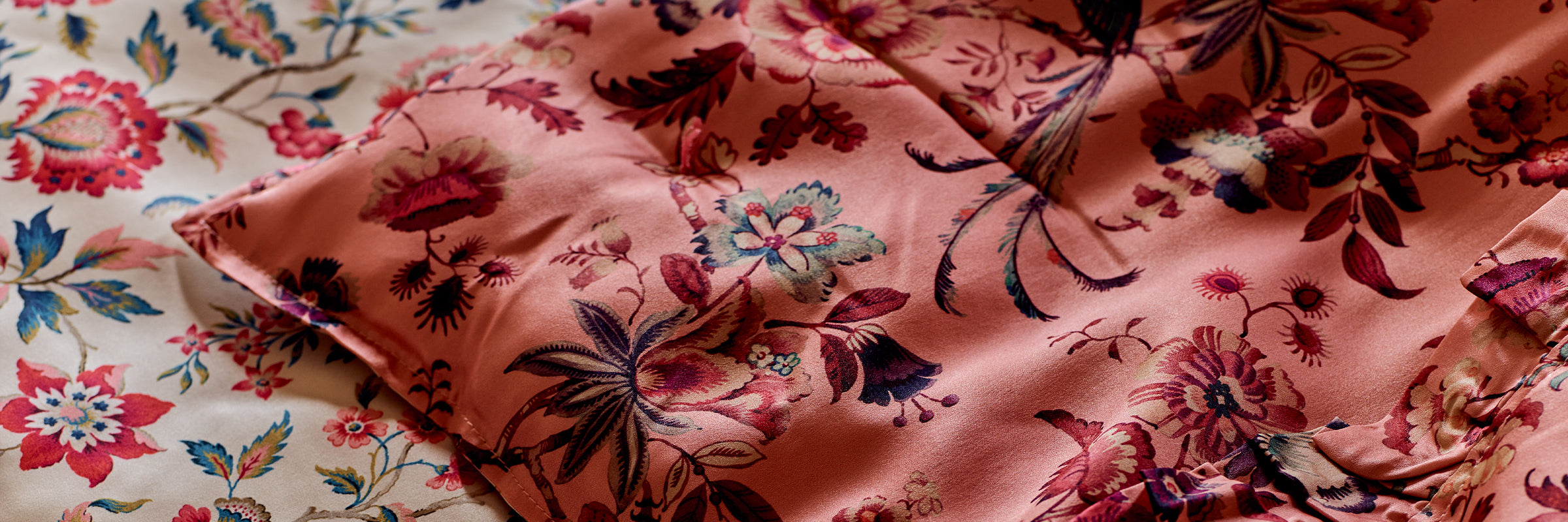
The beauty of Liberty print fabrics is there really is something for everyone. Every colour you can imagine and abstract, conversation, floral and geometric prints, and all as stunning as the next (as if you'd expect anything less!). Thanks to this plethora of prints creating contrast is easy, and we don't just mean colour. When using more than one print in a space contrasting sizes and print styles makes for victorious schemes. If floral is your thing, like it is ours, obviously, then consider the sizing of the florals within a print. Layering up lots of small florals can often feel busy, whilst mixing large and small florals together creates texture and interest. One of my favourite eclectic hotel schemes mixed beautiful, painterly florals on cotton with rustic striped linen and it was something I've wanted to recreate ever since.
I really hope this has helped give you some ideas of where to start when pairing some of the gorgeous Liberty fabrics Coco & Wolf use for our products. If you're looking for even more inspiration head on over to our Fabric page where we have begun to pop some of our favourite print combinations. You're welcome!
Leave a comment